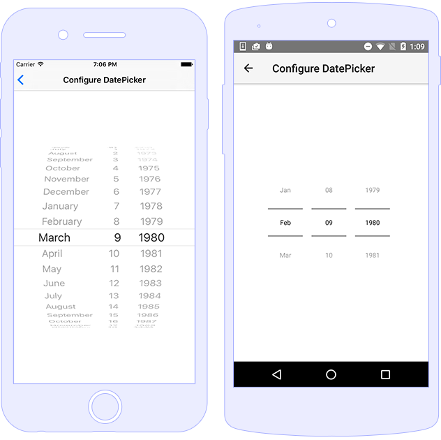
Date Picker
DatePicker control enables the user to choose a
date as a ready-to-use dialog. Every date part can be picked
separately by its corresponding section of the control - for
day, month and year.

Usage
Using DatePicker is as straightforward as setting
year, month, and day.
Alternatively, you can set the date property
(accepts a Date object). If required you can also
set minDate and maxDate.
<DatePicker year="1980" month="4" day="20"
            [minDate]="minDate" [maxDate]="maxDate"
            (dateChange)="onDateChanged($event)"
            (dayChange)="onDayChanged($event)"
            (monthChange)="onMonthChanged($event)"
            (yearChange)="onYearChanged($event)"
            (loaded)="onDatePickerLoaded($event)"
            verticalAlignment="center">
</DatePicker>
import { Component } from "@angular/core";
import { DatePicker } from "tns-core-modules/ui/date-picker";

@Component({
    moduleId: module.id,
    templateUrl: "./usage.component.html"
})
export class DatePickerUsageComponent {
    minDate: Date = new Date(1975, 0, 29);
    maxDate: Date = new Date(2045, 4, 12);

    onDatePickerLoaded(args) {
        // const datePicker = args.object as DatePicker;
    }

    onDateChanged(args) {
        console.log("Date New value: " + args.value);
        console.log("Date value: " + args.oldValue);
    }

    onDayChanged(args) {
        console.log("Day New value: " + args.value);
        console.log("Day Old value: " + args.oldValue);
    }

    onMonthChanged(args) {
        console.log("Month New value: " + args.value);
        console.log("Month Old value: " + args.oldValue);
    }

    onYearChanged(args) {
        console.log("Year New value: " + args.value);
        console.log("Year Old value: " + args.oldValue);
    }
}
Styling
.date-picker {
    background-color: olivedrab;
    border-color: burlywood;
    border-width: 2;
    border-radius: 10;
    color: whitesmoke;
    vertical-align: middle;
}
<DatePicker year="1980" month="4" day="20" class="date-picker"></DatePicker>
Note: On Android the native widgets android.widget.DatePicker is not allowing runtime changes to the
colorproperty. So if you want to have a different color for your day/month/year properties, you need to change it via the Android resources by providing customstyles.xml(invalues-v21) where the style forandroid:textColorPrimarycan be overwritten.
Properties
| Name | Type | Description |
|---|---|---|
date |
Date |
Gets or sets the entire date as Date object.
|
minDate |
Date |
Gets or sets the min date |
maxDate |
Date |
Gets or sets the max date |
day |
number |
Gets or sets the day. The days start from 1. |
month |
number |
Gets or sets the month. The months start from 1. |
year |
number |
Gets or sets the year. |
Events
| Name | Description |
|---|---|
dateChange |
Emitted when the date property is changed.
|
dayChange |
Emitted when the day property is changed.
|
monthChange |
Emitted when the month property is changed.
|
yearChange |
Emitted when the year property is changed.
|
API References
| Name | Type |
|---|---|
| tns-core-modules/ui/date-picker | Module |
| DatePicker | Class |
Native Component
| Android | iOS |
|---|---|
| android.widget.DatePicker | UIDatePicker |