RadAutoCompleteTextView Getting Started
In this article, you will learn how to initialize RadAutoCompleteTextView and use it with its basic configuration inside an NativeScript + Angular applications. The code snippets from this section are available as a standalone demo application.
Installation
RadAutoCompleteTextView is distributed through
the nativescript-ui-autocomplete package, so before
using it, you need to run the following command to add the
plugin to your application:
tns plugin add nativescript-ui-autocomplete
Initialization
Before proceeding, make sure that the
NativeScriptUIAutoCompleteTextViewModule
from the nativescript-ui-autocomplete plugin has been
imported in an ngModule in your app. For example:
import { NativeScriptUIAutoCompleteTextViewModule } from "nativescript-ui-autocomplete/angular";
@NgModule({
    schemas: [NO_ERRORS_SCHEMA],
    imports: [
        ....
        NativeScriptUIAutoCompleteTextViewModule,
        ....
    ],
    declarations: [
        ....
    ]
})
export class AutoCompleteExamplesModule { }

....
Demo.
To create a RadAutoCompleteTextView you should
use the RadAutoCompleteTextView tag in your .html file. Once you
have added the tag you should specify value for the
items property of the control.
<RadAutoCompleteTextView #autocomplete [items]="dataItems" displayMode="Tokens">
</RadAutoCompleteTextView>
In order to provide suggestions that will be used by
RadAutoCompleteTextView you need to provide a
collection of items of type TokenModel:
import { Component, ViewChild } from "@angular/core";
import { ObservableArray } from "tns-core-modules/data/observable-array";
import { TokenModel, AutoCompleteCompletionMode, AutoCompleteDisplayMode, AutoCompleteSuggestMode } from "nativescript-ui-autocomplete";
import { RadAutoCompleteTextViewComponent } from "nativescript-ui-autocomplete/angular";

@Component({
    moduleId: module.id,
    selector: "tk-autocomplete-getting-started",
    templateUrl: "autocomplete-getting-started.component.html"
})
export class AutoCompleteGettingStartedComponent {
    private _items: ObservableArray<TokenModel>;
    private countries = ["Australia", "Albania", "Austria", "Argentina", "Maldives", "Bulgaria", "Belgium", "Cyprus", "Italy", "Japan",
        "Denmark", "Finland", "France", "Germany", "Greece", "Hungary", "Ireland",
        "Latvia", "Luxembourg", "Macedonia", "Moldova", "Monaco", "Netherlands", "Norway",
        "Poland", "Romania", "Russia", "Sweden", "Slovenia", "Slovakia", "Turkey", "Ukraine",
        "Vatican City", "Chad", "China", "Chile"];

    constructor() {
        this.initDataItems();
    }

    @ViewChild("autocomplete", { static: false }) autocomplete: RadAutoCompleteTextViewComponent;

    get dataItems(): ObservableArray<TokenModel> {
        return this._items;
    }

    private initDataItems() {
        this._items = new ObservableArray<TokenModel>();

        for (let i = 0; i < this.countries.length; i++) {
            this._items.push(new TokenModel(this.countries[i], undefined));
        }
    }
}
If necessarily, you can also use
RadAutoCompleteTextView's
hint property to provide a text that will be
displayed when there is no input; the text property
that allows you to change the text or get the current user input
or the noResultsText property to change the text
displayed when no suggestions are found.
Customize the Suggestions
When you start typing the input field, you will see the default
suggestion view displayed below the input field. If you want,
you can add a custom suggestion view and change its template
(through a ng-template with the
tkSuggestionItemTemplate directive) and/or fix its
height (through the suggestionViewHeight property).
Here's an example:
<RadAutoCompleteTextView [items]="dataItems" displayMode="Plain">
    <SuggestionView tkAutoCompleteSuggestionView suggestionViewHeight="300">
        <ng-template tkSuggestionItemTemplate let-item="item">
            <StackLayout orientation="vertical" padding="10">
                <Label [text]="item.text"></Label>
            </StackLayout>
        </ng-template>
    </SuggestionView>
</RadAutoCompleteTextView>
Customize the TokenModel
If you need, you can extend the TokenModel with an
id to track more easily the selected items or any other
information that you need that is missing from the default
model. Here's an example:
export class CityModel extends TokenModel {
    public id: number;
    public city: string;
    public country: string;
    constructor(id: number, city: string, country: string, image: string) {
        super(city + ", " + country, image);

        this.id = id;
        this.city = city;
        this.country = country;
    }

    toString() {
        return this.id + ": " + this.city + ", " + this.country;
    }
}
Then you can use the new type to populate the list of items that
will be bound to RadAutoCompleteTextView's
items property:
private initDataItems() {
    if (!this._items) {
        this._items = new ObservableArray<CityModel>();
        for (let i = 0; i < data.items.length; i++) {
            const d = data.items[i].flag;
            const ds = "res://" + d;
            this._items.push(new CityModel(data.items[i].id, data.items[i].city, data.items[i].country, ds));
        }
    }
}
You can also display the properties added to your custom model in the template of the suggestions:
<SuggestionView tkAutoCompleteSuggestionView>
    <ng-template tkSuggestionItemTemplate let-item="item">
        <GridLayout columns="auto, *">
            <Image [src]="item.image" marginLeft="10" width="50" verticalAlignment="center"></Image>
            <Label [text]="item.city" marginLeft="10" col="1" verticalAlignment="center"></Label>
            <Label [text]="item.country" marginRight="10" col="1" verticalAlignment="center" textAlignment="right"></Label>
        </GridLayout>
    </ng-template>
</SuggestionView>
Apply CSS
RadAutoCompleteTextView can be customized through CSS. You can use the following type selectors to define the styles for the different elements:
- RadAutoCompleteTextView: Can be used to apply styles for the whole component.
- SuggestionView: Can be used to apply styles for the SuggestionView that displays below the input field.
- Token: Can be used to apply styles for the Tokens that get added to the input field when they are selected from the suggestions.
- ClearButton: Can be used to apply styles for the 'X' used to clear the current input
- TokenClearButton: Can be used to apply styles for the 'X' inside a Token, that is used to remove that Token from the input field.
- NoResultsLabel: Can be used to apply styles for the text that is displayed when no suggestions are found for the current input.
Each of these selectors supports a subset of properties that can be applied:
- RadAutoCompleteTextView supports: color, padding, margin, background-related properties (background, background-color, etc.), border-related properties (border-color, border-width, etc.), font-related properties (font-size, font-weight, etc.); these can also be applied for RadAutoCompleteTextView when its state is focus
- SuggestionView supports: color, margin, background-related properties (background, background-color, etc.), border-related properties (border-color, border-width, etc.), font-related properties (font-size, font-weight, etc.)
- Token supports: color, padding, margin, background-related properties (background, background-color, etc.), border-related properties (border-color, border-width, etc.), font-related properties (font-size, font-weight, etc.); these can also be applied for Token when its state is selected
- ClearButton and TokenClearButton support: color and background-image. The color can be used to tint the image used by default, while background-image can be used to use a custom image.
- NoResultsLabel supports: color and font-related properties (font-size, font-weight, etc.)
Here's an example CSS:
Example 1: Applying css to RadAutoCompleteTextView instances with class ac3
RadAutoCompleteTextView.ac3 {
margin: 5 10;
padding: 0 6;
color: #00C147;
background: white;
token-item-spacing: 12;
display-mode: tokens;
layout-mode: horizontal;
}

RadAutoCompleteTextView.ac3 Token {
color: #00C147;
background: white;
border-radius: 20;
border-color: #00C147;
border-width: 4;
font-weight: bold;
}

RadAutoCompleteTextView.ac3 Token:selected {
color: white;
background: #00C147;
}

RadAutoCompleteTextView.ac3 Token TokenClearButton {
color: #00C147;
}

RadAutoCompleteTextView.ac3 Token:selected TokenClearButton {
color: white;
}


RadAutoCompleteTextView.ac3 ClearButton {
color: #00C147;
}
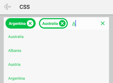
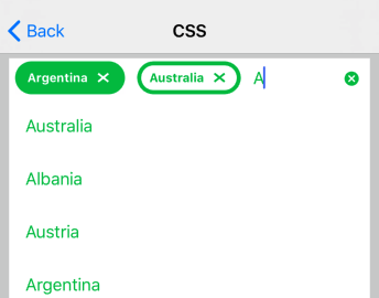
And here's how RadAutoCompleteTextView looks when the above CSS is applied:
Figure 1: RadAutoCompleteTextView with applied css on Android (left) and iOS (right)


References
Want to see this scenario in action? Check our SDK examples repo on GitHub. You will find this and many other practical examples with NativeScript UI.