RadDataForm - Describe the Properties
If you followed the article about
providing the source, you now know how to edit the source object's properties with
the default editors in RadDataForm for
NativeScript. This article will explain how you can customize
these editors and optionally change their type.
- Entity Property
- Adjust Editors with XML
- Adjust Editors with Code-Behind
- Adjust Editors with JSON
- References
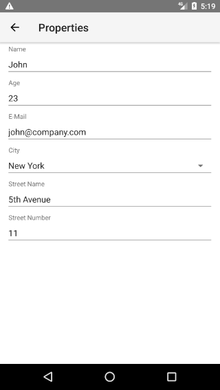
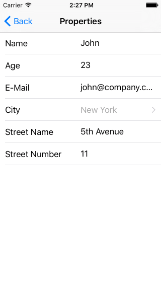
Figure 1: How RadDataForm can look if we describe the editors that will be used on Android (left) and iOS (right)


Entity Property
The
EntityProperty
is a helper class that allows you to describe each of the
properties of the edited source object. This way you can change
the type of the editor that will be used, the name of the label
that will be displayed with the editor, etc. When you set the
source
property of RadDataForm an
EntityProperty will be created for each of the
properties of the source object. Here's a list with the
adjustment options provided by the
EntityProperty
class:
-
name: This is the name of the property of your source object that will be described with this entity property. -
displayName: The text of the header/label of the editor. -
index: A number used to sort the editors. -
columnIndex: A number used to sort the editors which are on the same row when using grid layout. -
hidden: A boolean value indicating whether the editor for this property should be hidden. -
readOnly: A boolean value indicating whether the editor for this property will be in read only mode or it will allow editing. -
required: A boolean value specifying whether the current property is required for the entity to be saved (for example email in a registration form). -
hintText: A text that will be shown inside the editor when the its value isnull. -
valuesProvider: A list with values that are acceptable for values of the editor of this property. More information in this article. -
converter: APropertyConverterimplementation that can be used to convert the values visible in the editor to the values stored in the source object and vice versa. -
editor: APropertyEditorthat allows you to specify the type of the editor that will be used and its style. More information in the article about editors. -
validators: A list of validators that will be used to validate the value of the editor before saving it in the source object. More information in the section about validation. -
imageResource: The name of an image resource that will be used as a label of the editor. More information in the article about image labels.
Adjust Editors with HTML
One way to use the
EntityProperty
class to adjust the editors is to declare a
TKEntityProperty HTML tag and set the
tkDataFormProperty inline directive in it for each
property of your source object in the html and set the desired
values. Here's an example:
Example 1: Use EntityProperty in HTML
<TKEntityProperty tkDataFormProperty name="name" displayName="Name" index="0"></TKEntityProperty>
<TKEntityProperty tkDataFormProperty name="age" displayName="Age" index="1">
    <TKPropertyEditor tkEntityPropertyEditor type="Number"></TKPropertyEditor>
</TKEntityProperty>
<TKEntityProperty tkDataFormProperty name="email" displayName="E-Mail" index="2">
    <TKPropertyEditor tkEntityPropertyEditor type="Email"></TKPropertyEditor>
</TKEntityProperty>
<TKEntityProperty tkDataFormProperty name="city" displayName="City" index="3" valuesProvider="New York, Washington, Los Angeles">
    <TKPropertyEditor tkEntityPropertyEditor type="Picker"></TKPropertyEditor>
</TKEntityProperty>
<TKEntityProperty tkDataFormProperty name="street" displayName="Street Name" index="4"></TKEntityProperty>
<TKEntityProperty tkDataFormProperty name="streetNumber" displayName="Street Number" index="5">
    <TKPropertyEditor tkEntityPropertyEditor type="Number"></TKPropertyEditor>
</TKEntityProperty>
In this example, we have listed all properties of our data
object and specified their
displayName
(the header text for the editor) and their
index
(in order to ensure that they will be presented in a desired
order). Also we have picked an editor for some of the
properties. The Picker editor allows user to pick
one of the values presented as a
valuesProvider. More information about the editors, you can find
here.
Now if you run the application, you should get a result like in the image shown in the beginning.
Adjust Editors with Component's Code
Another way to make changes of each
EntityProperty
is through component's
code. You can access the
EntityProperty
instance for each property of your source object by passing its
name to the
getPropertyByName
method. Then you can change the value of each of its properties
except from
name
which is used to correctly link the
EntityProperty objects with the properties of the
source object:
Example 2: Use EntityProperty in component's code
public changeEditor() {
    const property = this.myRuntimeDataFormComp.dataForm.getPropertyByName("age");
    const propertyEditor = new PropertyEditor();
    propertyEditor.type = DataFormEditorType.Slider;
    property.editor = propertyEditor;
}
Adjust Editors with JSON
You can also use json with a list of property annotations which
will be used to setup the EntityProperty for each
property. Here's an example content of a json file which can be
used to achieve the same look of RadDataForm from
the image in the beginning of the article:
Example 3: Sample JSON metadata for RadDataForm
{
    "isReadOnly": false,
    "commitMode": "Immediate",
    "validationMode": "Immediate",
    "propertyAnnotations":
    [
        {
            "name": "name",
            "displayName": "Name",
            "index": 0
        },
        {
            "name": "age",
            "displayName": "Age",
            "index": 1,
            "editor": "Number"
        },
        {
            "name": "email",
            "displayName": "E-Mail",
            "index": 2,
            "editor": "Email"
        },
        {
            "name": "city",
            "displayName": "City",
            "index": 3,
            "editor": "Picker",
            "valuesProvider": ["New York", "Washington", "Los Angeles"]
        },
        {
            "name": "street",
            "displayName": "Street Name",
            "index": 4
        },
        {
            "name": "streetNumber",
            "displayName": "Street Number",
            "index": 5,
            "editor": "Number"
        }
    ]
}
The parsed content of the file is then passed to
RadDataForm through its
metadata
property:
Example 4: Set RadDataForm's metadata property
<RadDataForm tkExampleTitle tkToggleNavButton [source]="person" [metadata]="personMetadata"></RadDataForm>
The format of the JSON is self-explanatory but still here are
some remarks. The first key-value pairs set values of the
properties of the RadDataForm itself. Here are
these properties:
- isReadOnly: Boolean value that indicates whether the form is in read only mode.
- commitMode: String value representing the commit mode of the form. The acceptable values are: "Immediate", "OnLostFocus" and "Manual". You can read more about the commit modes here.
- validationMode: String value representing the validation mode of the form. The acceptable values are: "Immediate", "OnLostFocus" and "Manual". You can read more about the validation modes here.
- propertyAnnotations: An array that contains annotations for each of the properties.
The propertyAnnotations array contains an
annotation for each property of the source object which will be
taken into consideration when creating the corresponding
EntityProperty. Here's a list with the acceptable
keys inside the propertyAnnotations array:
- name: This is the name of the property of your source object that will be described with this annotation.
- displayName: The text of the header/label of the editor.
- groupName: A text used to specify the name of the group where this property has to be included.
- index: A number used to sort the editors.
- ignore: A boolean value indicating whether the editor for this property should be hidden.
- readOnly: A boolean value indicating whether the editor for this property will be in read only mode or it will allow editing.
- required: A boolean value specifying whether the current property is required for the entity to be saved (for example email in a registration form).
-
hintText: A text that will be shown inside
the editor when the its value is
null. - valuesProvider: A comma-separated list with values that are acceptable for values of the editor of this property.
-
editor: A
PropertyEditorthat allows you to specify the type of the editor that will be used for this property. More information in the article about editors. -
editorParams: A list of key-value pairs that
allows you to setup the editor that is used. The acceptable
keys are
step(used when the editor is of typeStepper),minandmax(used when the editor is of typeStepperorSlider).
Our next step is to determine the values of the source object reflecting the changes made through the editors. Here's how.
References
Want to see these scenarios in action? Check our SDK Examples for Angular repo on GitHub. You will find these and many other practical examples with NativeScript UI.
Related articles you might find useful: