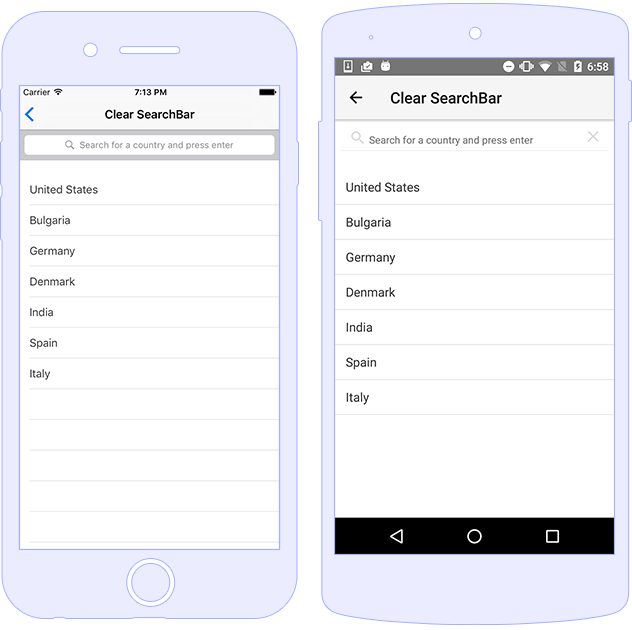
The SearchBar module represents a UI component
similar to UISearchBar in iOS and
android.widget.SearchView for Android, both of
which allow you to to create a simple filter for the the content
in the app. This component provides hint and
text properties and submit and
clear events.

Using SearchBar component with
hint and text with Angular binding.
The user input can be handled by using the submit,
textChange and clear events.
<SearchBar hint="Enter search term here ..."
            [text]="searchPhrase" (textChange)="onTextChanged($event)"
            (clear)="onClear($event)" (submit)="onSubmit($event)">
</SearchBar>
import { Component } from "@angular/core";
import { SearchBar } from "tns-core-modules/ui/search-bar";

@Component({
    moduleId: module.id,
    templateUrl: "./usage.component.html"
})
export class UsageComponent {
    searchPhrase: string;

    onSubmit(args) {
        const searchBar = args.object as SearchBar;
        console.log(`Searching for ${searchBar.text}`);
    }

    onTextChanged(args) {
        const searchBar = args.object as SearchBar;
        console.log(`Input changed! New value: ${searchBar.text}`);
    }

    onClear(args) {
        const searchBar = args.object as SearchBar;
        console.log(`Clear event raised`);
    }
}
<SearchBar hint="Search"
           color="yellow" backgroundColor="red"
           textFieldHintColor="whitesmoke"
           textFieldBackgroundColor="orangered">
</SearchBar>
| Name |
Type |
Description |
hint |
string |
Gets or sets the text of the search bar text field
hint/placeholder.
|
text |
string |
Gets or sets a search bar text. |
textFieldBackgroundColor |
Color |
Gets or sets the TextField background color of the
SearchBar component.
|
textFieldHintColor |
Color |
Gets or sets the TextField Hint color of the SearchBar
component.
|
| Name |
Description |
clear |
Emitted when the search is cleared (via the clear button).
|
submit |
Emitted when the serach term is submitted. |
