User Interface Layout Containers
Looking for a fun and easy way to learn about NativeScript layout containers? Try the interactive tutorials available at nslayouts.com!
AbsoluteLayout
The AbsoluteLayout is the simplest layout in NativeScript. It uses absolute left-top coordinates to position its children. The AbsoluteLayout will not enforce any layout constraints on its children and will not resize them at runtime when its size changes.
AbsoluteLayout Properties
None.
AbsoluteLayout Child Properties
| Property | Description |
|---|---|
| left | Gets or sets the distance, in pixels, between the left edge of the child and the left edge of its parent AbsoluteLayout client area. |
| top | Gets or sets the distance, in pixels, between the top edge of the child and the top edge of its parent AbsoluteLayout client area. |
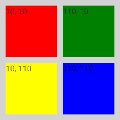
<Page xmlns="http://schemas.nativescript.org/tns.xsd">
 <AbsoluteLayout width="210" height="210" backgroundColor="lightgray">
   <Label text="10, 10" left="10" top="10" width="90" height="90" backgroundColor="red"/>
   <Label text="110, 10" left="110" top="10" width="90" height="90" backgroundColor="green"/>
   <Label text="110, 110" left="110" top="110" width="90" height="90" backgroundColor="blue"/>
   <Label text="10, 110" left="10" top="110" width="90" height="90" backgroundColor="yellow"/>
 </AbsoluteLayout>
</Page>
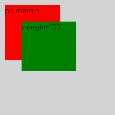
<Page xmlns="http://schemas.nativescript.org/tns.xsd">
  <AbsoluteLayout width="210" height="210" backgroundColor="lightgray">
    <Label text="no margin" left="10" top="10" width="100" height="100" backgroundColor="red"/>
    <Label text="margin='30'" left="10" top="10" margin="30" width="100" height="90" backgroundColor="green"/>
  </AbsoluteLayout>
</Page>
DockLayout
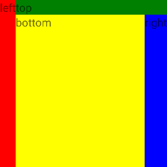
The DockLayout is a layout that provides a docking mechanism for
child elements to the left, right, top, bottom or center of the
layout. To define the docking side of a child element, use its
dock property. To dock a child element to the
center of the DockLayout, it must be the last child of the
DockLayout and the stretchLastChild property of the
DockLayout must be set to true.
DockLayout Properties
| Property | Description |
|---|---|
| stretchLastChild |
Gets or sets a value that indicates whether the last child
element within a DockLayout stretches to fill the
remaining available space. The default value is
true.
|
DockLayout Child Properties
| Property | Description |
|---|---|
| dock |
Specifies the Dock position of a child element that is
inside a DockLayout. Possible values are
left, top,
right and bottom.
|
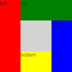
Example for stretchLastChild="false"
<Page xmlns="http://schemas.nativescript.org/tns.xsd">
  <DockLayout width="210" height="210" backgroundColor="lightgray" stretchLastChild="false">
    <Label text="left" dock="left" width="60" backgroundColor="red"/>
    <Label text="top" dock="top" height="60" backgroundColor="green"/>
    <Label text="right" dock="right" width="60" backgroundColor="blue"/>
    <Label text="bottom" dock="bottom" height="60" backgroundColor="yellow"/>
  </DockLayout>
</Page>
Example for stretchLastChild="true"
<Page xmlns="http://schemas.nativescript.org/tns.xsd">
  <DockLayout width="210" height="210" backgroundColor="lightgray" stretchLastChild="true">
    <Label text="left" dock="left" backgroundColor="red"/>
    <Label text="top" dock="top" backgroundColor="green"/>
    <Label text="right" dock="right" backgroundColor="blue"/>
    <Label text="bottom" dock="bottom" backgroundColor="yellow"/>
  </DockLayout>
</Page>
Example for multiple child elements on one side
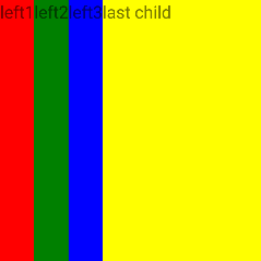
<Page xmlns="http://schemas.nativescript.org/tns.xsd">
  <DockLayout width="210" height="210" backgroundColor="lightgray" stretchLastChild="true">
    <Label text="left1" dock="left" backgroundColor="red"/>
    <Label text="left2" dock="left" backgroundColor="green"/>
    <Label text="left3" dock="left" backgroundColor="blue"/>
    <Label text="last child" backgroundColor="yellow"/>
  </DockLayout>
</Page>
GridLayout
The GridLayout is a layout that arranges its child elements in a
table structure of rows and columns. A cell can contain multiple
child elements, they can span over multiple rows and columns,
and even overlap each other. The GridLayout has one column and
one row by default. To add additional columns and rows, you have
to specify column definition items (separated by commas) to the
columns property and row definition items
(separated by commas) to the rows property of the
GridLayout. The width of a column and the height of a row can be
specified as an absolute amount of pixels, as a percentage of
the available space or automatically:
- Absolute: Fixed size of pixels.
- Star (*): Takes as much space as available (after filling all auto and fixed sized columns), proportionally divided over all star-sized columns. So 3/7 means the same as 30/70.
- Auto: Takes as much space as needed by the contained child element(s).
GridLayout Properties
| Property | Description |
|---|---|
| columns |
A string value representing column widths delimited with
commas. Column widths can be either an absolute
number, auto or *.
A number indicates an absolute column width,
auto makes the column as wide as its widest
child, and * makes the column occupy all
available horizontal space.
|
| rows |
A string value representing row heights delimited with
commas. Row heights can be either an absolute
number, auto or *.
A number indicates an absolute row height,
auto makes the row as high as its highest
child, and * makes the row occupy all
available vertical space.
|
GridLayout Child Properties
| Property | Description |
|---|---|
| row | Gets or sets a value that indicates which row child content within a GridLayout it should appear in. |
| col | Gets or sets a value that indicates which column child content within a GridLayout it should appear in. |
| rowSpan | Gets or sets a value that indicates the total number of rows that child content spans within a GridLayout. |
| colSpan | Gets or sets a value that indicates the total number of columns that child content spans within a GridLayout. |
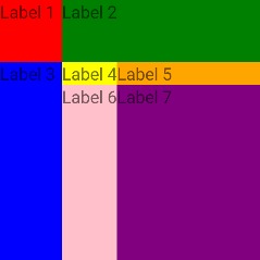
Example for basic Grid usage
<Page xmlns="http://schemas.nativescript.org/tns.xsd">
  <GridLayout columns="50, auto, *" rows="50, auto, *" width="210" height="210" backgroundColor="lightgray" >
    <Label text="Label 1" row="0" col="0" backgroundColor="red"/>
    <Label text="Label 2" row="0" col="1" colSpan="2" backgroundColor="green"/>
    <Label text="Label 3" row="1" col="0" rowSpan="2" backgroundColor="blue"/>
    <Label text="Label 4" row="1" col="1" backgroundColor="yellow"/>
    <Label text="Label 5" row="1" col="2" backgroundColor="orange"/>
    <Label text="Label 6" row="2" col="1" backgroundColor="pink"/>
    <Label text="Label 7" row="2" col="2" backgroundColor="purple"/>
  </GridLayout>
</Page>
Example for sizing with star (*)
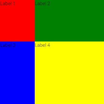
- Columns: One star plus two stars is equal to three stars. (* + 2* = 3*). Divide GridLayout width (300) by 3 to get 100. So first column is 1 x 100 = 100 pixels wide and second column is 2 x 100 = 200 pixels wide. 100 + 200 = 300.
- Rows: Two stars plus three stars is equal to five stars. (2* + 3* = 5*). Divide GridLayout height (300) by 5 to get 60. So first row is 2 x 60 = 120 pixels high and second row is 3 x 60 = 180 pixels high. 120 + 180 = 300.
<Page xmlns="http://schemas.nativescript.org/tns.xsd">
  <GridLayout columns="*,2*" rows="2*,3*" width="300" height="300" backgroundColor="lightgray" >
    <Label text="Label 1" col="0" row="0" backgroundColor="red"/>
    <Label text="Label 2" col="1" row="0" backgroundColor="green"/>
    <Label text="Label 3" col="0" row="1" backgroundColor="blue"/>
    <Label text="Label 4" col="1" row="1" backgroundColor="yellow"/>
  </GridLayout>
</Page>
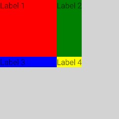
Example for fixed and auto sizing
- The first column and the first row have fixed sizes of 100 and 100 respectively. They will be exactly this wide/high regardless of their children's dimensions. They would still be exactly this wide/high even if they don't have any children.
-
The second column and the second row are
auto. This means that they are measured with infinite available space and then sized to their content.
<Page xmlns="http://schemas.nativescript.org/tns.xsd">
  <GridLayout columns="100,auto" rows="100,auto" width="210" height="210" backgroundColor="lightgray" >
    <Label text="Label 1" col="0" row="0" backgroundColor="red"/>
    <Label text="Label 2" col="1" row="0" backgroundColor="green"/>
    <Label text="Label 3" col="0" row="1" backgroundColor="blue"/>
    <Label text="Label 4" col="1" row="1" backgroundColor="yellow"/>
  </GridLayout>
</Page>
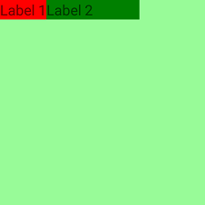
Example for no width and horizontalAlignment != stretch
When the GridLayout has no explicit width set and
its horizontalAlignment is set and is not
stretch, the star columns will not occupy the
entire available space (200 from parent StackLayout).
<Page xmlns="http://schemas.nativescript.org/tns.xsd">
  <StackLayout width="200" height="200" backgroundColor="palegreen">
    <GridLayout columns="*,2*" horizontalAlignment="left" verticalAlignment="top" backgroundColor="lightgray">
      <Label text="Label 1" col="0" backgroundColor="red"/>
      <Label text="Label 2" col="1" backgroundColor="green"/>
    </GridLayout>
  </StackLayout>
</Page>
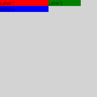
Example for column stretching Label 3 has a fixed width of 150 pixels. Label 1 is given more space than it actually needs, because Label 3 stretches the auto column.
<Page xmlns="http://schemas.nativescript.org/tns.xsd">
  <GridLayout columns="auto,100" rows="auto,auto" width="300" height="300" backgroundColor="lightgray" >
    <Label text="Label 1" col="0" row="0" backgroundColor="red"/>
    <Label text="Label 2" col="1" row="0" backgroundColor="green"/>
    <Label text="Label 3" width="150" col="0" row="1" backgroundColor="blue"/>
  </GridLayout>
</Page>
Example for complex structure Image has
fixed width and height of 72 and span the both rows. For the
first Label, it's given more space by using
colSpan="2". Third Lable is given more
space than it actually needs, because fourth
Label stretches the auto column.
<Page xmlns="http://schemas.nativescript.org/tns.xsd">
  <GridLayout columns="auto, *, auto" rows="auto, 25" verticalAlignment="top" backgroundColor="lightgray">
    <Image src="~/cute.jpg" rowSpan="2" width="72" height="72" margin="3" verticalAlignment="top"/>
    <Label text="My cat loves the camera" textWrap="true" col="1" colSpan="2" minHeight="50" fontSize="20" margin="3"/>
    <Label text="John Smith" col="1" row="1" fontSize="14" horizontalAlignment="left" verticalAlignment="bottom" margin="3"/>
    <Label text="comments: 26" col="2" row="1" color="#10C2B0" fontSize="14" verticalAlignment="bottom" margin="3"/>
  </GridLayout>
</Page>

Example for creating grid dynamically via code behind
You can find a runnable version of this example in NativeScript Playground for JavaScript here and for TypeScript here.
<Page loaded="onPageLoaded" xmlns="http://schemas.nativescript.org/tns.xsd">

</Page>
const Color = require("tns-core-modules/color").Color;
const Button = require("tns-core-modules/ui/button").Button;
const Label = require("tns-core-modules/ui/label").Label;
const layout = require("tns-core-modules/ui/layouts/grid-layout");
const [GridLayout, GridUnitType, ItemSpec] = [layout.GridLayout, layout.GridUnitType, layout.ItemSpec];

function onPageLoaded(args) {
    // Grid wrapper
    const grid = new GridLayout();

    // Create title Label and add it as a child to our grid
    const titleLabel = new Label();
    titleLabel.text = "NativeScript";
    grid.addChild(titleLabel);

    // Create info Label and add it as a child to our grid
    const infoLabel = new Label();
    infoLabel.text = "Truly native mobile apps";
    infoLabel.backgroundColor = new Color("gray");
    grid.addChild(infoLabel);

    // Create the share Button and add it as a child to our grid
    const shareButton = new Button();
    shareButton.text = "Share This!";
    grid.addChild(shareButton);

    // Add Grid Rows as if rows="*, 100, auto" cols="250, *"

    // * - occupy the remaining available space
    grid.addRow(new ItemSpec(1, GridUnitType.STAR));

    // 100 - fixed column width.
    // If elements in this row need more vertical space - we will coerce their height to the row height.
    grid.addRow(new ItemSpec(100, GridUnitType.PIXEL));

    // auto - the row height will be the height of the tallest element in that row.
    grid.addRow(new ItemSpec(1, GridUnitType.AUTO));

    grid.addColumn(new ItemSpec(250, GridUnitType.PIXEL));
    grid.addColumn(new ItemSpec(1, GridUnitType.STAR));

    // Assign views to their row (if not set default row is 0)
    GridLayout.setRow(titleLabel, 0); // titleLabel set to row 0
    GridLayout.setRow(infoLabel, 1); // infoLabel set to row 1
    GridLayout.setRow(shareButton, 2); // shareButton set to row 2

    // Assign views to their col (if not set default column is 0)
    GridLayout.setColumn(titleLabel, 0); // titleLabel set to column 0
    GridLayout.setColumn(infoLabel, 0); // infoLabel set to column 0
    GridLayout.setColumn(shareButton, 1); // shareButton set to column 1

    // Assign ColumnSpan for views
    GridLayout.setColumnSpan(infoLabel, 2); // infoLabel set with columnSpan = 2

    const page = args.object;
    page.content = grid;
}
exports.onPageLoaded = onPageLoaded;
import { Color } from "tns-core-modules/color";
import { EventData } from "tns-core-modules/data/observable";
import { Button } from "tns-core-modules/ui/button";
import { Label } from "tns-core-modules/ui/label";
import { GridLayout, GridUnitType, ItemSpec } from "tns-core-modules/ui/layouts/grid-layout";
import { Page } from "tns-core-modules/ui/page";

export function onPageLoaded(args: EventData) {
    // Grid wrapper
    const grid = new GridLayout();

    // Create title Label and add it as a child to our grid
    const titleLabel = new Label();
    titleLabel.text = "NativeScript";
    grid.addChild(titleLabel);

    // Create info Label and add it as a child to our grid
    const infoLabel = new Label();
    infoLabel.text = "Truly native mobile apps";
    infoLabel.backgroundColor = new Color("gray");
    grid.addChild(infoLabel);

    // Create the share button and add it as a child to our grid
    const shareButton = new Button();
    shareButton.text = "Share This!";
    grid.addChild(shareButton);

    // Add Grid Rows as if rows="*, 100, auto" cols="250, *"

    // * - occupy the remaining available space
    grid.addRow(new ItemSpec(1, GridUnitType.STAR));

    // 100 - fixed column width.
    // If elements in this row need more vertical space - we will coerce their height to the row height.
    grid.addRow(new ItemSpec(100, GridUnitType.PIXEL));

    // auto - the row height will be the height of the tallest element in that row.
    grid.addRow(new ItemSpec(1, GridUnitType.AUTO));

    grid.addColumn(new ItemSpec(250, GridUnitType.PIXEL));
    grid.addColumn(new ItemSpec(1, GridUnitType.STAR));

    // Assign views to their row (if not set default row is 0)
    GridLayout.setRow(titleLabel, 0); // titleLabel set to row 0
    GridLayout.setRow(infoLabel, 1);  // infoLabel set to row 1
    GridLayout.setRow(shareButton, 2); // shareButton set to row 2

    // Assign views to their col (if not set default column is 0)
    GridLayout.setColumn(titleLabel, 0); // titleLabel set to column 0
    GridLayout.setColumn(infoLabel, 0);  // infoLabel set to column 0
    GridLayout.setColumn(shareButton, 1); // shareButton set to column 1

    // Assign ColumnSpan for views
    GridLayout.setColumnSpan(infoLabel, 2); // infoLabel set with columnSpan = 2

    const page = <Page>args.object;
    page.content = grid;
}
StackLayout
The StackLayout stacks its child elements below or beside each other, depending on its orientation. It is very useful to create lists.
StackLayout Properties
| Property | Description |
|---|---|
| orientation |
Gets or sets a value indicating whether the child items
should be stacked in the horizontal or vertical direction.
Possible values are vertical and
horizontal. The default value is
vertical.
|
StackLayout Child Properties
None.
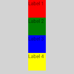
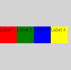
Example for orientation="vertical"
<Page xmlns="http://schemas.nativescript.org/tns.xsd">
  <StackLayout orientation="vertical" width="210" height="210" backgroundColor="lightgray">
    <Label text="Label 1" width="50" height="50" backgroundColor="red"/>
    <Label text="Label 2" width="50" height="50" backgroundColor="green"/>
    <Label text="Label 3" width="50" height="50" backgroundColor="blue"/>
    <Label text="Label 4" width="50" height="50" backgroundColor="yellow"/>
  </StackLayout>
</Page>
Example for orientation="horizontal"
<Page xmlns="http://schemas.nativescript.org/tns.xsd">
  <StackLayout orientation="horizontal" width="210" height="210" backgroundColor="lightgray">
    <Label text="Label 1" width="50" height="50" backgroundColor="red"/>
    <Label text="Label 2" width="50" height="50" backgroundColor="green"/>
    <Label text="Label 3" width="50" height="50" backgroundColor="blue"/>
    <Label text="Label 4" width="50" height="50" backgroundColor="yellow"/>
  </StackLayout>
</Page>
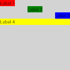
Example for horizontal alignment of children
<Page xmlns="http://schemas.nativescript.org/tns.xsd">
  <StackLayout orientation="vertical" width="210" height="210" backgroundColor="lightgray">
    <Label text="Label 1" horizontalAlignment="left" backgroundColor="red"/>
    <Label text="Label 2" horizontalAlignment="center" backgroundColor="green"/>
    <Label text="Label 3" horizontalAlignment="right" backgroundColor="blue"/>
    <Label text="Label 4" horizontalAlignment="stretch" backgroundColor="yellow"/>
  </StackLayout>
</Page>
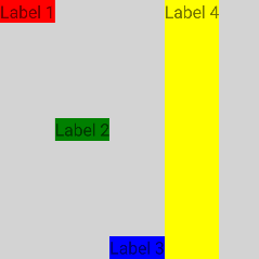
Example for vertical alignment of children
<Page xmlns="http://schemas.nativescript.org/tns.xsd">
  <StackLayout orientation="horizontal" width="210" height="210" backgroundColor="lightgray">
    <Label text="Label 1" verticalAlignment="top" backgroundColor="red"/>
    <Label text="Label 2" verticalAlignment="center" backgroundColor="green"/>
    <Label text="Label 3" verticalAlignment="bottom" backgroundColor="blue"/>
    <Label text="Label 4" verticalAlignment="stretch" backgroundColor="yellow"/>
  </StackLayout>
</Page>
WrapLayout
The WrapLayout is similar to the StackLayout, but it does not just stack all child elements to one column/row, it wraps them to new columns/rows if no space is left. The WrapLayout is often used with items of the same size, but this is not a requirement.
WrapLayout Properties
| Property | Description |
|---|---|
| orientation |
Gets or sets a value indicating the flow direction. If
orientation is horizontal, items are arranged
in rows. If orientation is vertical, items
are arranged in columns. The default value is
horizontal.
|
| itemWidth | Gets or sets the width used to measure and layout each child. Default value is Number.NaN, which does not restrict children. |
| itemHeight | Gets or sets the height used to measure and layout each child. Default value is Number.NaN, which does not restrict children. |
WrapLayout Child Properties
None.
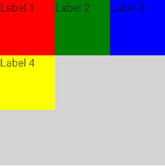
Example for orientation="horizontal"
<Page xmlns="http://schemas.nativescript.org/tns.xsd">
  <WrapLayout orientation="horizontal" width="210" height="210" backgroundColor="lightgray">
    <Label text="Label 1" width="70" height="70" backgroundColor="red"/>
    <Label text="Label 2" width="70" height="70" backgroundColor="green"/>
    <Label text="Label 3" width="70" height="70" backgroundColor="blue"/>
    <Label text="Label 4" width="70" height="70" backgroundColor="yellow"/>
  </WrapLayout>
</Page>
Example for orientation="vertical"
<Page xmlns="http://schemas.nativescript.org/tns.xsd">
  <WrapLayout orientation="vertical" width="210" height="210" backgroundColor="lightgray">
    <Label text="Label 1" width="70" height="70" backgroundColor="red"/>
    <Label text="Label 2" width="70" height="70" backgroundColor="green"/>
    <Label text="Label 3" width="70" height="70" backgroundColor="blue"/>
    <Label text="Label 4" width="70" height="70" backgroundColor="yellow"/>
  </WrapLayout>
</Page>
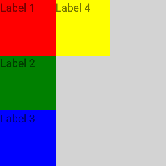
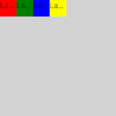
Example for itemWidth="30" and
itemHeight="30"
<Page xmlns="http://schemas.nativescript.org/tns.xsd">
  <WrapLayout itemWidth="30" itemHeight="30" width="210" height="210" backgroundColor="lightgray">
    <Label text="Label 1" width="70" height="70" backgroundColor="red"/>
    <Label text="Label 2" width="70" height="70" backgroundColor="green"/>
    <Label text="Label 3" width="70" height="70" backgroundColor="blue"/>
    <Label text="Label 4" width="70" height="70" backgroundColor="yellow"/>
  </WrapLayout>
</Page>
FlexboxLayout
The FlexboxLayout is a non-conforming implementation of the CSS Flexible Box Layout based on an existing Apache-2 licensed flexbox implementation hosted on github.com/google/flexbox-layout.
FlexboxLayout Properties
| Property | Description | Values |
|---|---|---|
| flexDirection | Gets or sets a value indicating the direction flex items are placed in the flex container. |
|
| flexWrap | Gets or sets a value indicating whether the flex items are forced in a single line or can be flowed into multiple lines. If set to multiple lines, it also defines the cross-axis which determines the direction new lines are stacked in. |
|
| justifyContent | Gets or sets a value indicating the alignment along the main axis. It helps distribute extra free space leftover when either all the flex items on a line are inflexible, or are flexible but have reached their maximum size. It also exerts some control over the alignment of items when they overflow the line. |
|
| alignItems | Gets or sets a value indicating how flex items are laid out along the cross axis on the current line. You can think of it as the justifyContent version for the cross-axis (perpendicular to the main-axis). |
|
| alignContent | Gets or sets a value that helps aligning a flex container's lines within it when there is extra space in the cross-axis, similar to how justifyContent aligns individual items within the main-axis. |
|
NOTE: On iOS, you cannot set
alignItemstobaseline.
FlexboxLayout Child Properties
| Property | Description |
|---|---|
| order | Gets or sets a value that changes the default ordering of flex items. |
| flexGrow | Gets or sets a unitless value that serves as a proportion indicating whether the flex item is able to grow if necessary. It dictates what amount of the available space inside the flex container the item should take up. |
| flexShrink | Gets or sets a value indicating the "flex shrink factor", which determines how much the flex item will shrink relative to the rest of the flex items in the flex container when there is not enough space on the row. When omitted, it is set to 1 and the flex shrink factor is multiplied by the flex basis when distributing negative space. |
| alignSelf |
Gets or sets a value that makes it possible to override
the alignItems value for specific flex items. This
property accepts the same 5 values as the alignItems:
flex-start (cross-start margin edge of the
item is placed on the cross-start line),
flex-end (cross-end margin edge of the item
is placed on the cross-end line),
center (item is centered in the cross-axis),
baseline (items are aligned such as their
baseline are aligned), and stretch (stretch
to fill the container but still respect min-width /
max-width). The default value is stretch.
|
| flexWrapBefore |
Gets or sets a boolean value controlling item wrapping.
Setting it to true on flexbox item will force
it to wrap on a new line. The default value is
false. This property is not part of the
official flexbox specification.
|
NOTE: On iOS, you cannot set
alignSelftobaseline.
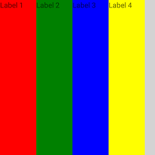
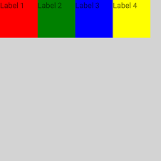
Example for flexDirection="row" and
alignItems="stretch" (default)
<Page xmlns="http://schemas.nativescript.org/tns.xsd">
  <FlexboxLayout width="300" height="300" backgroundColor="lightgray">
    <Label text="Label 1" width="70" height="70" backgroundColor="red"/>
    <Label text="Label 2" width="70" height="70" backgroundColor="green"/>
    <Label text="Label 3" width="70" height="70" backgroundColor="blue"/>
    <Label text="Label 4" width="70" height="70" backgroundColor="yellow"/>
  </FlexboxLayout>
</Page>
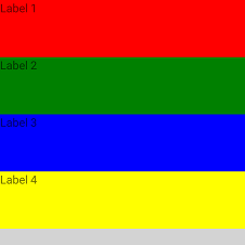
Example for flexDirection="column" and
alignItems="stretch" (default)
<Page xmlns="http://schemas.nativescript.org/tns.xsd">
  <FlexboxLayout flexDirection="column" width="300" height="300" backgroundColor="lightgray">
    <Label text="Label 1" width="70" height="70" backgroundColor="red"/>
    <Label text="Label 2" width="70" height="70" backgroundColor="green"/>
    <Label text="Label 3" width="70" height="70" backgroundColor="blue"/>
    <Label text="Label 4" width="70" height="70" backgroundColor="yellow"/>
  </FlexboxLayout>
</Page>
Example for flexDirection="row" and
alignItems="flex-start"
<Page xmlns="http://schemas.nativescript.org/tns.xsd">
  <FlexboxLayout alignItems="flex-start" width="300" height="300" backgroundColor="lightgray">
    <Label text="Label 1" width="70" height="70" backgroundColor="red"/>
    <Label text="Label 2" width="70" height="70" backgroundColor="green"/>
    <Label text="Label 3" width="70" height="70" backgroundColor="blue"/>
    <Label text="Label 4" width="70" height="70" backgroundColor="yellow"/>
  </FlexboxLayout>
</Page>
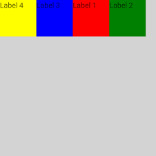
Example for flexDirection="row", custom
order
<Page xmlns="http://schemas.nativescript.org/tns.xsd">
  <FlexboxLayout alignItems="flex-start" width="300" height="300" backgroundColor="lightgray">
    <Label order="3" text="Label 1" width="70" height="70" backgroundColor="red"/>
    <Label order="4" text="Label 2" width="70" height="70" backgroundColor="green"/>
    <Label order="2" text="Label 3" width="70" height="70" backgroundColor="blue"/>
    <Label order="1" text="Label 4" width="70" height="70" backgroundColor="yellow"/>
  </FlexboxLayout>
</Page>
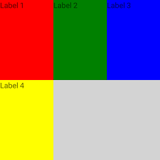
Example for flexWrap="wrap"
<Page xmlns="http://schemas.nativescript.org/tns.xsd">
  <FlexboxLayout flexWrap="wrap" height="300" width="300" backgroundColor="lightgray">
    <Label text="Label 1" width="100" height="50" backgroundColor="red"/>
    <Label text="Label 2" width="100" height="50" backgroundColor="green"/>
    <Label text="Label 3" width="100" height="50" backgroundColor="blue"/>
    <Label text="Label 4" width="100" height="50" backgroundColor="yellow"/>
  </FlexboxLayout>
</Page>
Example for flexDirection="column-reverse",
justifyContent="space-around" and
alignItems="stretch"
<Page xmlns="http://schemas.nativescript.org/tns.xsd">
  <FlexboxLayout flexDirection="column-reverse" justifyContent="space-around" alignItems="stretch"
    height="300" width="300" backgroundColor="lightgray">
    <Label text="Label 1" width="50" height="50" backgroundColor="red"/>
    <Label alignSelf="center" text="Label 2" width="50" height="50" backgroundColor="green"/>
    <Label alignSelf="flex-end" text="Label 3" width="50" height="50" backgroundColor="blue"/>
    <Label text="Label 4" width="50" height="50" backgroundColor="yellow"/>
  </FlexboxLayout>
</Page>
