RadDataForm Styling
If you followed the
getting started
section, you now know how to edit an object's properties with
RadDataForm for NativeScript. This article will
show you how to change the style of each editor, its label or
the groups if grouping is enabled.
CSS
The easiest way to change the styles in RadDataForm is to apply css styles. You can use the following type selectors to define the styles for the different elements:
- RadDataForm: Can be used to apply styles the whole DataForm.
- DataFormEditorLabel: Can be used to style the labels of the editors.
- DataFormEditorCore: Can be used to style the different editors - TextField, DatePicker, etc.
-
PropertyEditor: Can be used to style the full
editor for a property, that includes the core editor
(
DataFormEditorCore) and its header text (DataFormEditorLabel).
Please note that currently the group headers can't be styled with CSS.
Figure 1: RadDataForm with applied css on Android (left) and iOS (right)
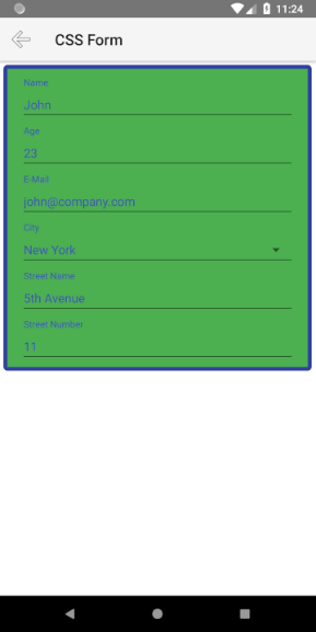
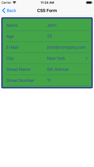
Here's the css that is used for the form in the above pictures:
Example 1: Applying css with the RadDataForm type selector
RadDataForm {
    background-color: #4CAF50;
    color: #3F51B5;
    padding: 5;
    margin: 5;
    border-color: #303F9F;
    border-width: 5;
    border-radius: 5;
}

PropertyEditor {
    background-color: transparent;
    separator-color: #303F9F;
}
The above example uses the RadDataForm and
PropertyEditor selectors. Here's how you can use
the other available selectors (DataFormEditorCore
and DataFormEditorLabel) to match the separate
elements of the form and also how to apply a different style to
editors while they are focussed:
Example 2: Applying css with the PropertyEditor, DataFormEditorLabel and DataFormEditorCore type selectors
PropertyEditor {
    background-color: #00BCD4;
    color: #303F9F;
    border-color: #303F9F;
    border-width: 5;
    border-radius: 5;
    margin: 10;
    padding: 10;
    font-size: 14;
}

PropertyEditor:focus {
    background-color: #303F9F;
}

DataFormEditorLabel {
    color:#212121;
    background-color: white;
    font-style: italic;
    padding: 10;
    margin: 10;
    border-color: #303F9F;
    border-width: 5;
    border-radius: 5;
    width: 150;
    position: left;
}

DataFormEditorCore {
    margin: 10;
    padding: 10;
    background-color: white;
    border-color: #303F9F;
    border-width: 5;
    border-radius: 5;
    font-family: 'Times New Roman', Times, serif;
}

PropertyEditor[type='Email'] {
    font-weight: bold;
}

EntityProperty[name='name'] DataFormEditorLabel {
    width: 0;
    visibility: collapsed;
}
Note how you can use EntityProperty with
name to match only the editors for a specific
property and also you can use PropertyEditor with
type to match all editors of a specific type.
Here's how the form will look when the above style is applied.
Figure 2: RadDataForm with applied css on Android (left) and iOS (right)
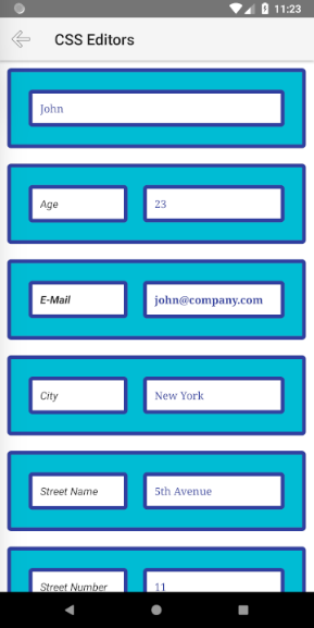
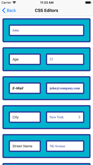
This is the list of supported css properties for the different selectors:
| property | description | RadDataForm | PropertyEditor | DataFormEditorLabel | DataFormEditorCore |
|---|---|---|---|---|---|
color |
Sets the color for the foreground. | yes | yes | yes | yes |
background-color |
Sets the color for the background. | yes | yes | yes | yes |
border-color |
Sets the color for the border. | yes | yes | yes | yes |
font-family |
Sets the font family. | yes | yes | yes | yes |
font-style |
Sets the font style (normal or italic) . | yes | yes | yes | yes |
font-weight |
Sets the font weight. | yes | yes | yes | yes |
font-size |
Sets the font size (dip only). | yes | yes | yes | yes |
margin |
Sets the distance of the view within its parent. | yes | yes | yes | yes |
padding |
Sets the distance between the border and the content. | yes | yes | yes | yes |
border-width |
Sets the width of the border. | yes | yes | yes | yes |
border-radius |
Sets the radius of the border. | yes | yes | yes | yes |
visibility |
Sets the view visibility (visible or collapsed). | yes | no | yes | no |
position |
Sets the position of the label relative to the editor. (left or top) | no | no | yes | no |
width |
Sets the width of the view. | yes | no | only when position is left | no |
height |
Sets the height of the view. | yes | no | no | no |
separator-color |
Sets the color of the line separator of the editor. | no | only on iOS | no | no |
Styling Editors
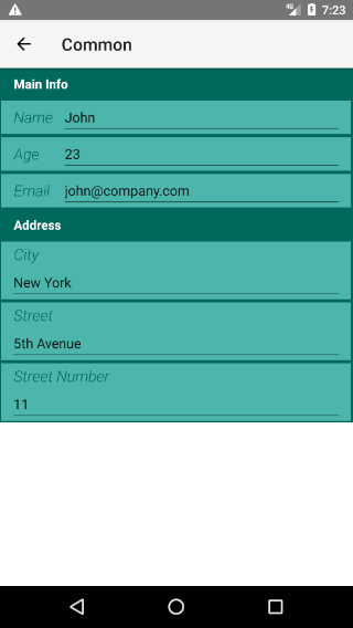
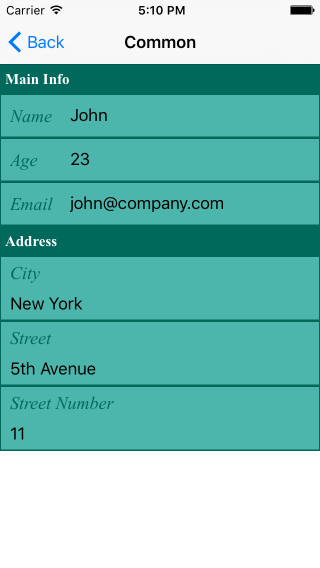
Here's another option to change the styles of RadDataForm - this
time without css. In order to change the style of an editor, you
can create an instance of
PropertyEditorStyle
and set it to the
PropertyEditor's
propertyEditorStyle
property.
Here's what you can update in editor through its style:
-
fillColor: The color that will be used as background of the editor. -
strokeColor: The color of the border of the editor. -
strokeWidth: The width of the border of the editor. -
separatorColor: The color of the line separator of the editor /iOS only/. -
labelTextSize: The size of the text of the editor's label. -
labelFontName: The name of the font that is used for the text of the editor's label. -
labelFontStyle: TheDataFormFontStylefor the text of the editor's label. -
editorHorizontalOffset: Horizontal offset to be applied to the editor. -
editorVerticalOffset: Vertical offset to be applied to the editor. -
labelHorizontalOffset: Horizontal offset to be applied to the editor's label. -
labelVerticalOffset: Vertical offset to be applied to the editor's label. -
labelHidden: Indicates whether this editor will have its label visible or hidden. -
labelPosition: Indicates the position of the label relative to the editor. It must be one of:Left(default on iOS) orTop(default on Android). -
labelWidth: The width of the label. It has effect only if thelabelPositionisLeft.
If you need to make changes to the styles runtime, you can get
access the current style of an editor through the
EntityProperty. Here's an example of how to change the
fillColor for the editor of the property
name.
Figure 3: RadDataForm with some of the editor's styling properties changed on Android (left) and iOS (right)
Example 3: Changing the fillColor of an editor
export function changeEditorFill() {
    const property = <EntityProperty>dataform.getPropertyByName("name");
    property.editor.propertyEditorStyle.fillColor = new Color("LightBlue");
}
Note that in this example we make the change when
RadDataForm is already loaded and its editors are
initialized (in this case on a button tap), otherwise the
default
PropertyEditorStyle
may not be initialized and
propertyEditorStyle
will be undefined.
Styling Group Headers
In order to change the style of the header of a group, you need
to create an instance of
GroupTitleStyle
and set it to the
PropertyGroup's
titleStyle
property. Here's what you can update in the header of a group
through its style:
-
fillColor: The color that will be used as background of the group header. -
strokeColor: The color of the border of the group header. -
strokeWidth: The width of the border of the group header. -
separatorColor: The color of the line separator of the group header /iOS only/. -
labelTextSize: The size of the text of the group header. -
labelFontName: The name of the font that is used for the text of the group header. -
labelFontStyle: TheDataFormFontStylefor the text of the group header.
If you need to make changes to the styles runtime, you can get
access the current style of a group title through the
PropertyGroup. Here's an example of how to change the
labelTextColor for the group
Main Info.
Example 4: Changing the labelTextColor of a group header
export function changeGroupLabelTextColor() {
    const group = <PropertyGroup>dataform.getGroupByName("Main Info");
    group.titleStyle.labelTextColor = new Color("Blue");
}
Note that in this example we make the change when
RadDataForm is already loaded and its groups are
initialized (in this case on a button tap), otherwise the
default
GroupTitleStyle
may not be initialized and
titleStyle
will be undefined.
Example 5: Using some of the abovementioned styling properties in XML
<df:EntityProperty name="name" >
    <df:EntityProperty.editor>
        <df:PropertyEditor type="Text">
            <df:PropertyEditor.propertyEditorStyle>
                <df:PropertyEditorStyle strokeColor="#00695c" strokeWidth="2" fillColor="#4db6ac"
                        labelHidden="false" labelTextSize="18"
                        labelPosition="Left" labelWidth="60"
                        ios:labelFontName="Times New Roman" android:labelFontName="sans-serif-light"
                        labelFontStyle="Italic" labelTextColor="#00695c"/>
            </df:PropertyEditor.propertyEditorStyle>
        </df:PropertyEditor>
    </df:EntityProperty.editor>
</df:EntityProperty>
Styling Native Components
Figure 4: RadDataForm with editors' colors updated independently on Android (left) and iOS (right)
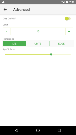
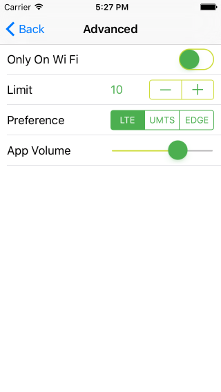
If you need to provide a more customized styling which is not
covered by the above properties, you can always fine-tune the
native editors for each platform. In order to do this, you can
use the editorUpdate event in
RadDataForm. First you can use the
propertyName from the passed arguments with the
events to determine if the currently updated editor is the one
you want to customize:
Example 6: Apply styling based on the name of a property
switch (args.propertyName) {
    case "appVolume": editorSetupSliderAndroid(args.editor); break;
If you want the customization to reflect all editors of specific
editor type you can do the check through the
EntityProperty that you can get with
RadDataForm's
getPropertyByName
method. Then you can check the editor type:
Example 7: Apply styling based on the type of an editor
let entityProperty: EntityProperty =
    (<RadDataForm>args.object).getPropertyByName(args.propertyName);
switch (entityProperty.editor.type) {
    case "Slider": editorSetupSliderIOS(args.editor); break;
If the currently updating editor is the one we want to customize
we can access the native editor through the
editor
property of the arguments passed with the event. Then depending
on the platform, we can access the actual view of the editor
with the getEditorView() method on Android and with
the editor property on iOS. Here's an example of
changing the style of the
Slider
editor independently on each platform:
Example 8: Change the colors of native Slider editor on each platform
export function editorSetupSliderAndroid(editor) {
    let coreEditor = <android.widget.SeekBar>editor.getEditorView();
    coreEditor.getThumb().setColorFilter(new android.graphics.PorterDuffColorFilter(colorDark.android, android.graphics.PorterDuff.Mode.SRC_IN));
    coreEditor.getProgressDrawable().setColorFilter(new android.graphics.PorterDuffColorFilter(colorLight.android, android.graphics.PorterDuff.Mode.SRC_IN));
}

export function editorSetupSliderIOS(editor) {
    let coreEditor = <UISlider>editor.editor;
    coreEditor.tintColor = colorLight.ios;
    coreEditor.thumbTintColor = colorDark.ios;
}
In this example we used the properties of the native views that
represent the Slider editor:
SeekBar
on Android and
UISlider
in iOS. Here's a list with each of the
RadDataForm editors and the corresponding types of
the native views used for that editor on each platform:
| Editor | Android Native View | iOS Native View |
|---|---|---|
Text |
EditText | TKTextField |
MultilineText |
EditText | UITextView |
Email |
EditText | TKTextField |
Password |
EditText | TKTextField |
Phone |
EditText | TKTextField |
Number |
EditText | TKTextField |
Decimal |
EditText | TKTextField |
Switch |
SwitchCompat | UISwitch |
Stepper |
RadNumberPicker | UIStepper |
Slider |
SeekBar | UISlider |
Picker |
Spinner | UIPickerView |
SegmentedEditor |
RadioGroup | UISegmentedControl |
List |
ListView | TKLabel |
DatePicker |
EditText | UIDatePicker |
TimePicker |
EditText | UIDatePicker |
AutoCompleteInline |
RadAutoCompleteTextView | TKAutoCompleteTextView |
Label |
TextView | UILabel |
Now that you know how to access the core editor view and what its type is you can dive deeper into the capabilities that the access to the native elements provides. For example you can further adjust the location of an editor and its background:
Figure 5: RadDataForm with editors' background updated manually on Android (left) and iOS (right)
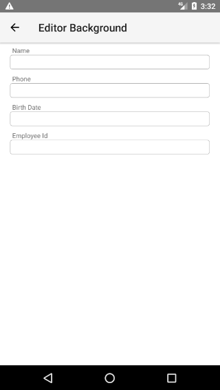
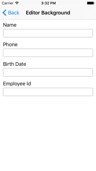
This is achieved again by using the
editorUpdate event in RadDataForm and
the native editor taken from the parameters of the event
arguments:
Example 9: Change the editor background of native editors on each platform
if (ios) {
    // Update editor padding
    const editorOffsets = new UIEdgeInsets({ top: editorPaddingVertical, left: editorPaddingHorizontal, bottom: editorPaddingVertical, right: editorPaddingHorizontal });
    editor.style.insets = editorOffsets;

    // Update core editor padding
    const textOffsets = new UIEdgeInsets({ top: coreEditorPaddingVertical, left: coreEditorPaddingHorizontal, bottom: coreEditorPaddingVertical, right: coreEditorPaddingHorizontal });
    if (editorHasValueLabel(editorType)) {
        editor.showAccessoryImage = false;
    }
    editor.editorCore.insets = textOffsets;

    // Update core editor background
    const layer = editor.editorCore.layer;
    layer.borderColor = strokeColor.ios.CGColor;
    layer.borderWidth = strokeWidth;
    layer.cornerRadius = cornerRadius;
} else {
    // Update editor padding
    const editorOffsetH = utilsModule.layout.toDevicePixels(coreEditorPaddingHorizontal);
    const editorOffsetV = utilsModule.layout.toDevicePixels(coreEditorPaddingVertical);
    editor.rootLayout().setPadding(editorOffsetH, editorOffsetV, editorOffsetH, editorOffsetV);

    // Update core editor padding
    const coreEditorView = editor.getEditorView();
    const textOffsetH = utilsModule.layout.toDevicePixels(coreEditorPaddingHorizontal);
    const textOffsetV = utilsModule.layout.toDevicePixels(coreEditorPaddingVertical);
    coreEditorView.setPadding(textOffsetH, textOffsetV, textOffsetH, textOffsetV);

    // Update core editor background
    const drawable = new android.graphics.drawable.GradientDrawable();
    drawable.setCornerRadius(utilsModule.layout.toDevicePixels(cornerRadius));
    drawable.setStroke(utilsModule.layout.toDevicePixels(strokeWidth), strokeColor.android);
    drawable.setColor(fillColor.android);
    coreEditorView.setBackgroundDrawable(drawable);
}
References
Want to see these scenarios in action? Check our SDK Examples repo on GitHub. You will find these and many other practical examples with NativeScript UI.
- Styling Common Example
- Styling Advanced Example
- Platform Adjustments Example
- Editor Background Example
Related articles you might find useful: